yes! there is a lot of room at the bottom. I can’t wait for the day when maps cover 40 orders of magnitude. Powers of 10, here we come.
Tag: visualization
NYC ridership since 1905

too bad openlayers / geoserver / postgis is slow as shit.
Sheets Gantt charts
who needs MS project? no one.
Sheets TimeLine Gadget
neat, although the edit UI kinda sucks
The Inner Life of the Cell
wow.
Kepler mission
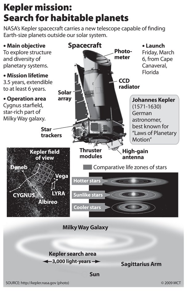
Launched today. Will search an area of 3000 light years in our neighbor arm, the sagittarius arm, for earth-like planets. Expected haul, 500.
2010-07-26: After finding more planets in the first year of the Kepler mission than all previous efforts combined: “earth-sized planets are common in the galaxy”
2011-02-01: Transit requires the right inclination for detection, and is quite unlikely, which means there should be 10k as many planets out there than they found. about 12M.
2013-11-23: Using a solar sail approach. Clever
NASA outlines ingenious plan to resurrect the Kepler planet hunter. “K2” mission would use its solar panels as a pointing device.
2015-12-15: Really awesome visualization about all the solar systems yet discovered.
2021-10-27: The final haul was 2662.
Tolkien internet map

foothills of philosophy, patent peaks, etc.
Adding time to maps
simile timeline integration
The basic idea of TimeMap is to wrap both the Google Maps API and SIMILE Timeline in a third API in order to control interactions between a map and a timeline on the page.
Visualizing Rails & Git
nice processing visualization to show that it is the tools that shaped the open source world’s fear of forking. with git, the cost of forking is so low that you get a cambrian explosion.
Mannahatta

On 1609-09-12, Henry Hudson noted the land was “as pleasant as one need tread upon,” and “as pleasant with Grasse and Flowers, and goodly Trees, as ever they had seene, and very sweet smells came from them.”
